Focus on Neutrals
- Posted on
- By Roy Caro Cohen
- Posted in Designing with Neutrals, Photography in Neutral colors, Wallart in Neutral Colors
- 0
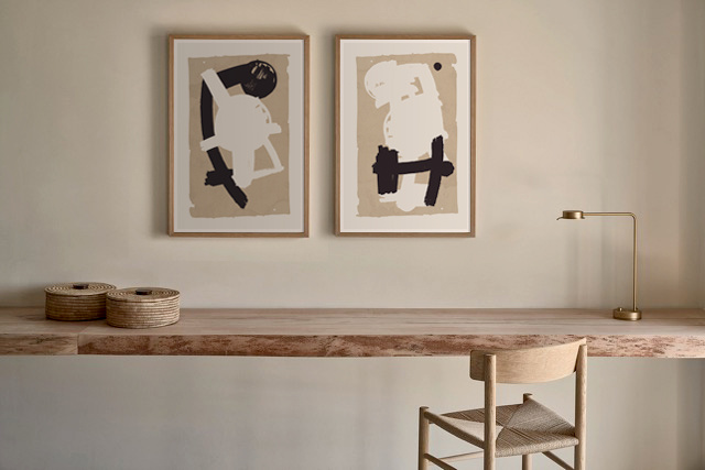
Neutral colors are far from boring. Selecting a neutral decorating scheme can benefit your design in many ways. They can be the backdrop that, when paired with a brighter tone, make the hue appear more vibrant or 'pop'. The human eye is naturally attracted to such colors with a higher intensity. Or, the use of brighter neutrals gives your room a more open, clean. and breezy look. Muted or darker neutrals can give a space a warmer and sharper appearance.
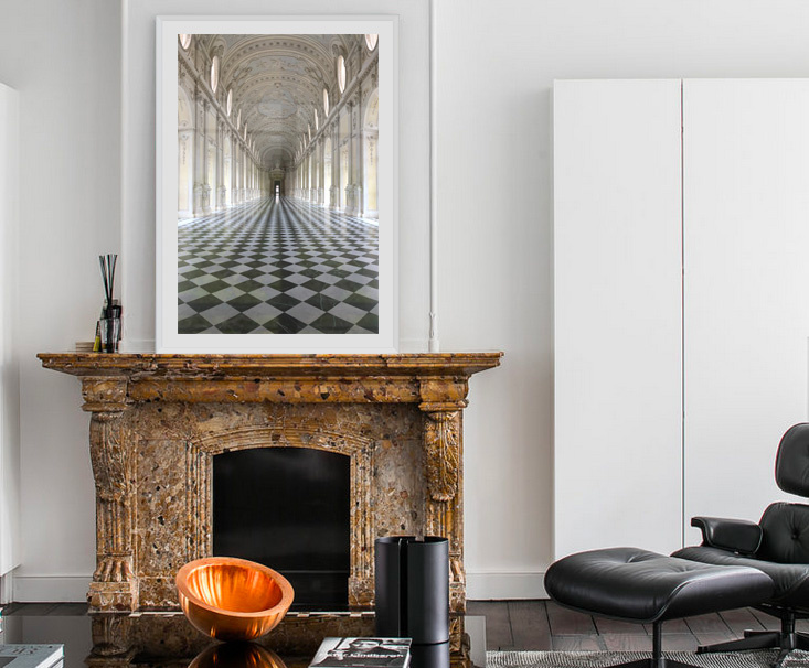
Neptis and Optas by Alejandro Franseschini
Watch this short video on use of neutral artwork in design applications.
Neutrals allow the eye to easily flow between each focal point. They can be used in decor in two basic ways—either as a soft, neutral only, quiet look, or as background colors for dramatic accents.
The four most common neutrals are black, white, brown and grey, and are created by mixing two complementary colors. These neutrals don’t have hue undertones, causing them to be considered “pure”.
The meaning of the word has evolved over the years. But “neutral” has extended its reach and includes some shades that you might not have considered. Even blues and greens, some of the complementary earth tones, have made their way into the neutral zone.
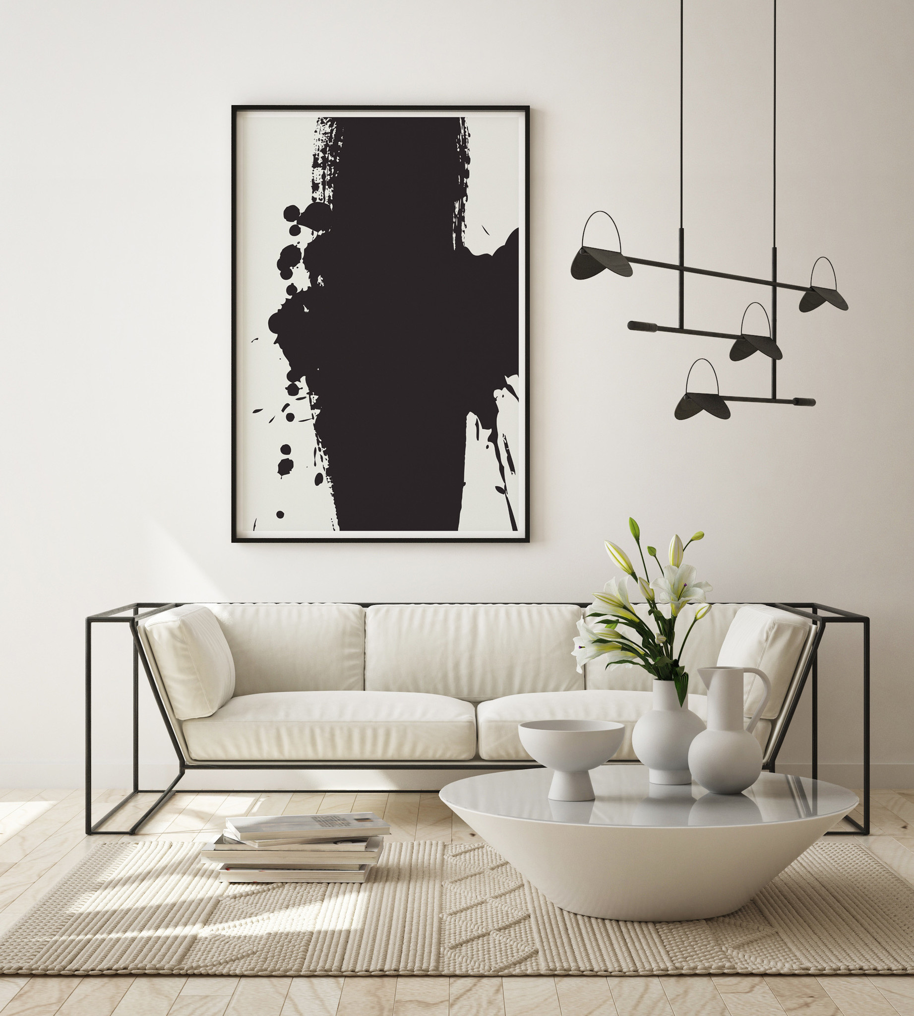
Black is a powerful neutral. It’s visual heft gives it authority and weight. When used in a palette, black is a base—allowing other colors to shine. However, when left alone, black can also be a dominant focal point.
Whichever neutral tone you treasure, this look’s enduring popularity proves you can always be on trend.
Thank you for reading!
Roy CARO COHEN


Comments
Be the first to comment...