
Framed Perspectives: Art & Interior Design Blog | The Picturalist
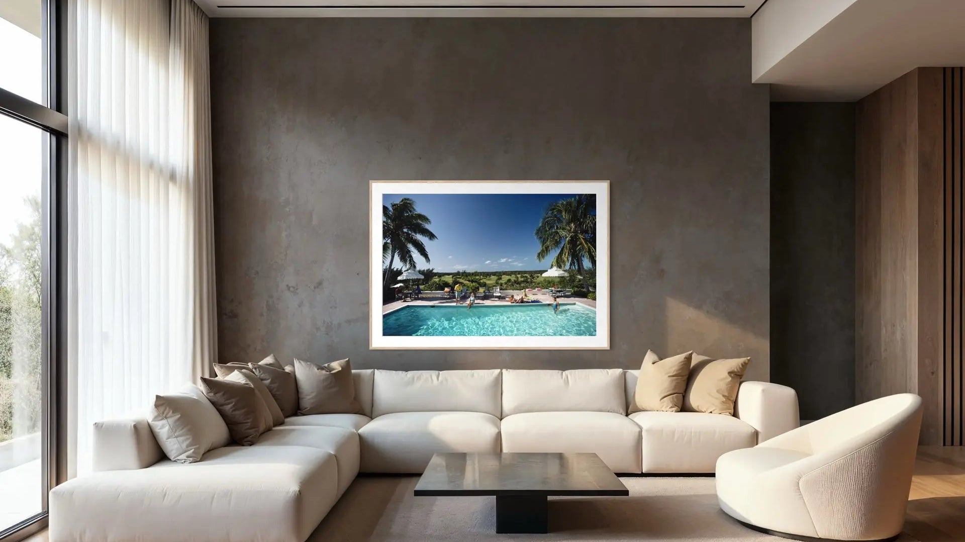
Poolside by Slim Aarons: Vintage Pool Photography Your Guests Will Want To Dive Into
Explore Poolside by Slim Aarons: glamorous vintage pool photography in vibrant colors. Museum-grade prints that bring summer spirit to your walls, season after season.
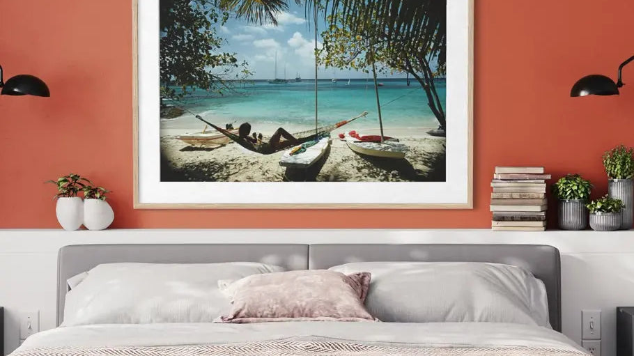
Buy Authentic Slim Aarons Prints: A Curation of Icons and Rare Finds
Shop authentic Slim Aarons prints from the Getty Images Gallery archive, hand-picked by Roy Caro. Museum-grade, exclusively distributed by The Picturalist.
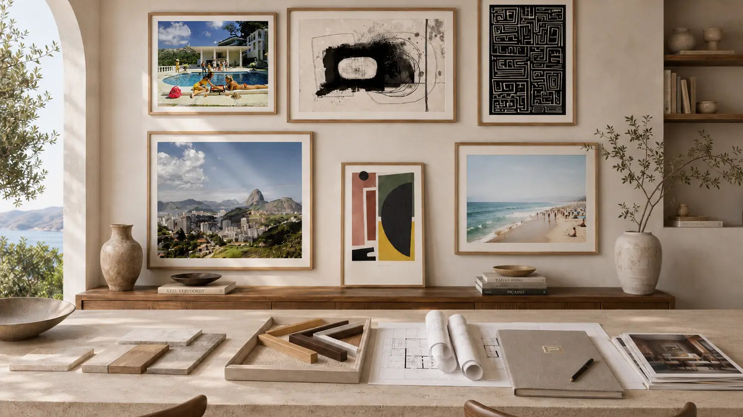
The Private Edition: Turn Your Own Photograph Into a Custom Fine Art Print
The Private Edition lets you upload your own image and have it produced as a museum-quality custom fine art print, giclée printed on archival paper and professionally framed, with a studio file review before printing.
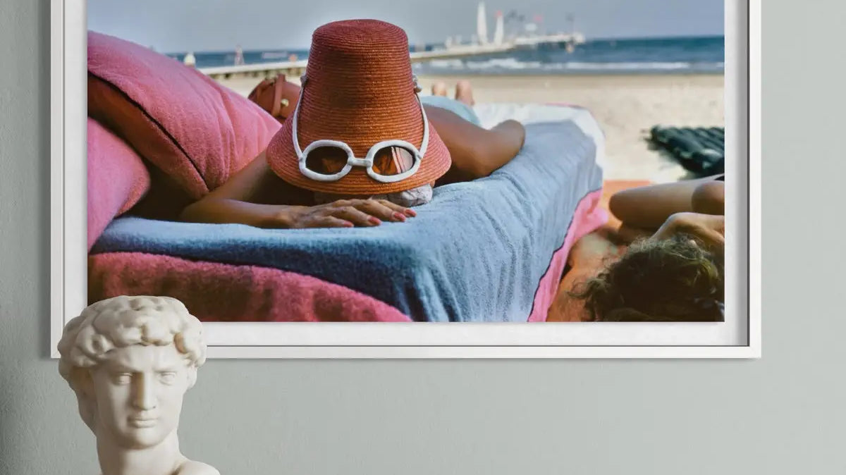
Coastal Wall Art for Every Mood: Vintage Glamour or Contemporary Seascapes?
Coastal decorating in 2026 has moved past blue accents and driftwood clichés. Here's how vintage glamour, contemporary seascapes, and underwater photography each create a distinct coastal mood, and how to choose the right one for your space.
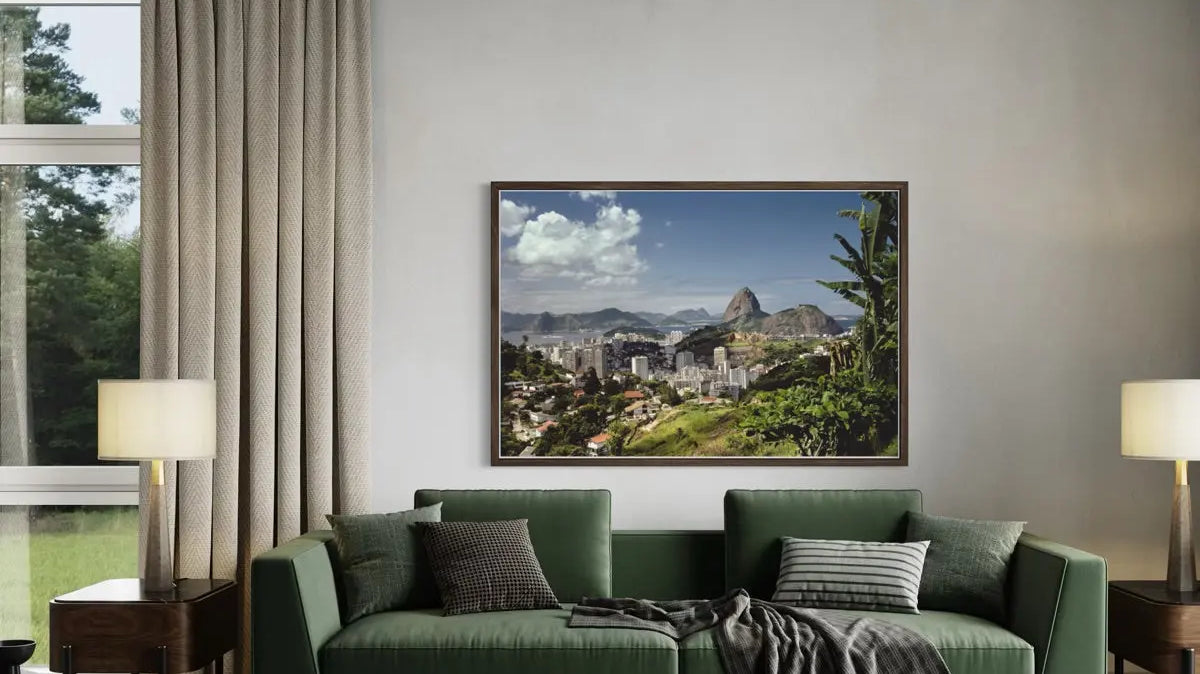
Slim Aarons vs. Contemporary Resort Photography: Which One Belongs on Your Wall
Slim Aarons defined “the good life” through five decades of observed, unstaged moments by the pool. Today's resort photographers are building something different from the same sun and turquoise water, and knowing the difference changes which one belongs in your home.
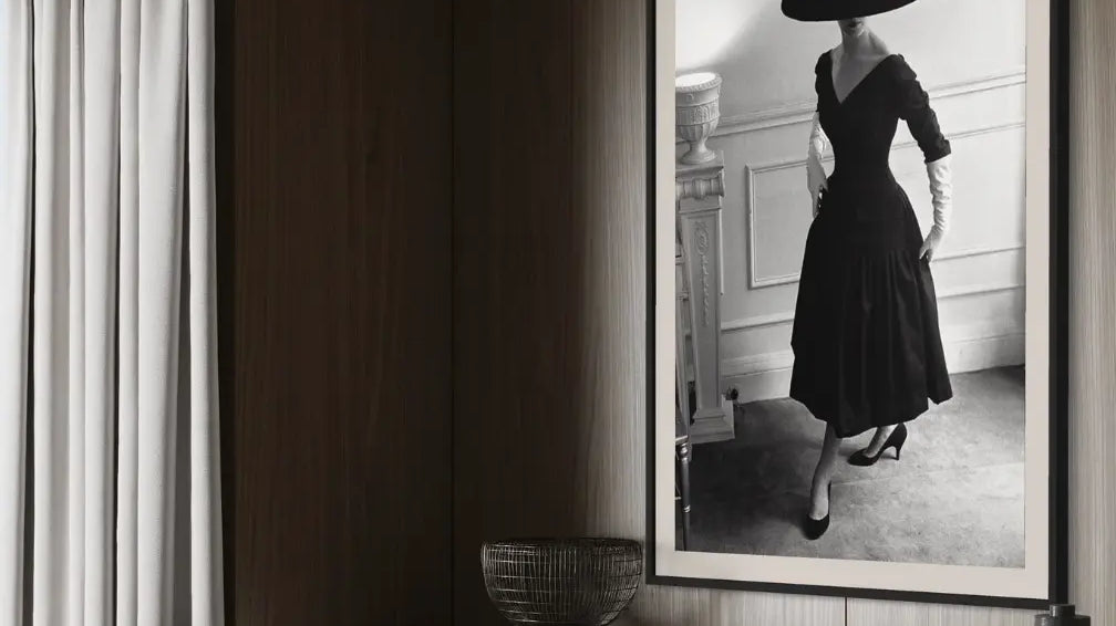
Photography Turns 200: What This Year's Martin Parr Retrospectives Teach Collectors About Buying Photography
France is marking 200 years since Niépce's first surviving photograph with a year of exhibitions. But the retrospectives actually shaping how collectors think about photography this year belong to Martin Parr, and what they reveal has less to do with anniversaries than with what makes a body of work worth owning.
Cloud Dancer: How to Build a Room Around Pantone's 2026 Color of the Year
Pantone named Cloud Dancer, a soft and balanced white, its Color of the Year for 2026. For collectors building a calmer room, the real challenge isn't the wall color: it's choosing art with enough presence to hold its own against all that quiet.

Why Art Consulting Belongs at the Start of Every Residential Development
Most developers treat artwork as a punch-list item, something to hang once the walls are painted and the last invoice is paid. The developments buyers actually remember treated it as part of the architecture itself, planned as early as the floor plan.
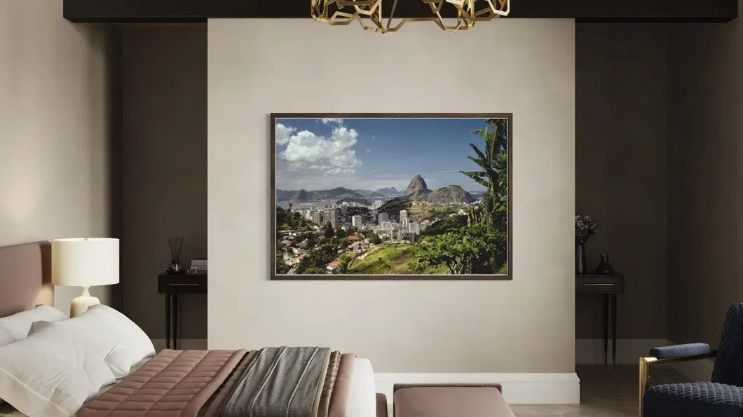
Art Procurement Timelines Decide Whether a Hospitality Project Feels Curated or Assembled
Artwork is usually the last decision on a hospitality project's schedule, and it shows. The properties guests actually remember treat art procurement as a parallel track from day one, not a punch-list item squeezed in before opening.
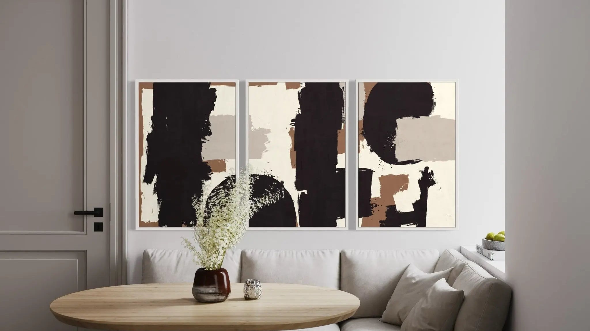
Small Walls, Big Impact: Choosing Wall Art for Apartments and Condos
A small apartment doesn't excuse smaller decisions, it demands sharper ones. One well-scaled piece of art can reshape how a room breathes, reads, and feels lived-in. This is why compact interiors call for bolder art choices, not more cautious ones.
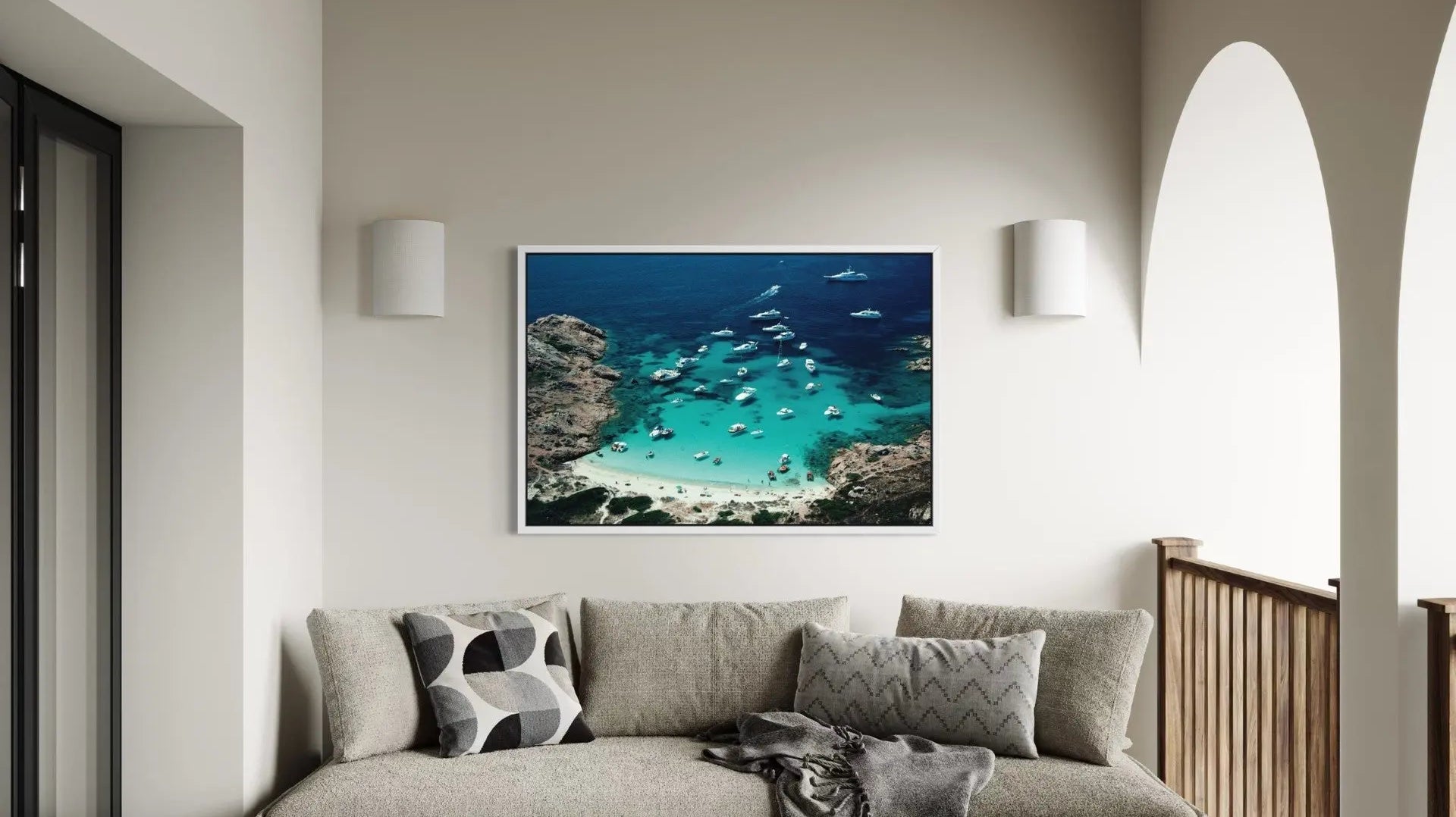
ChromaLuxe Metal Prints Turn Your Patio and Poolside Into the Most Surprising Room in the House
Some rooms in a home are simply hostile to art: too humid, too bright, too exposed to steam or sun. Here is where ChromaLuxe metal prints are the right material choice, and why a beautiful canvas is often the wrong one.
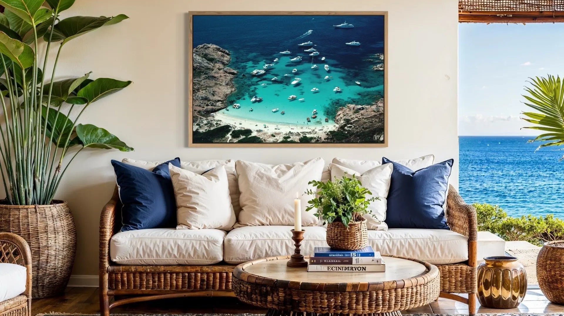
ChromaLuxe Metal Prints Turn Weather-Exposed Terraces and Rooftops Into a Hotel's Most Memorable Room
Commercial walls get more sun, more steam, and more cleaning than any residential wall ever will. Here is where ChromaLuxe metal prints hold up in hospitality, food service, and corporate spaces, and why that durability is a design decision, not just a maintenance one.


