
Framed Perspectives: Art & Interior Design Blog | The Picturalist
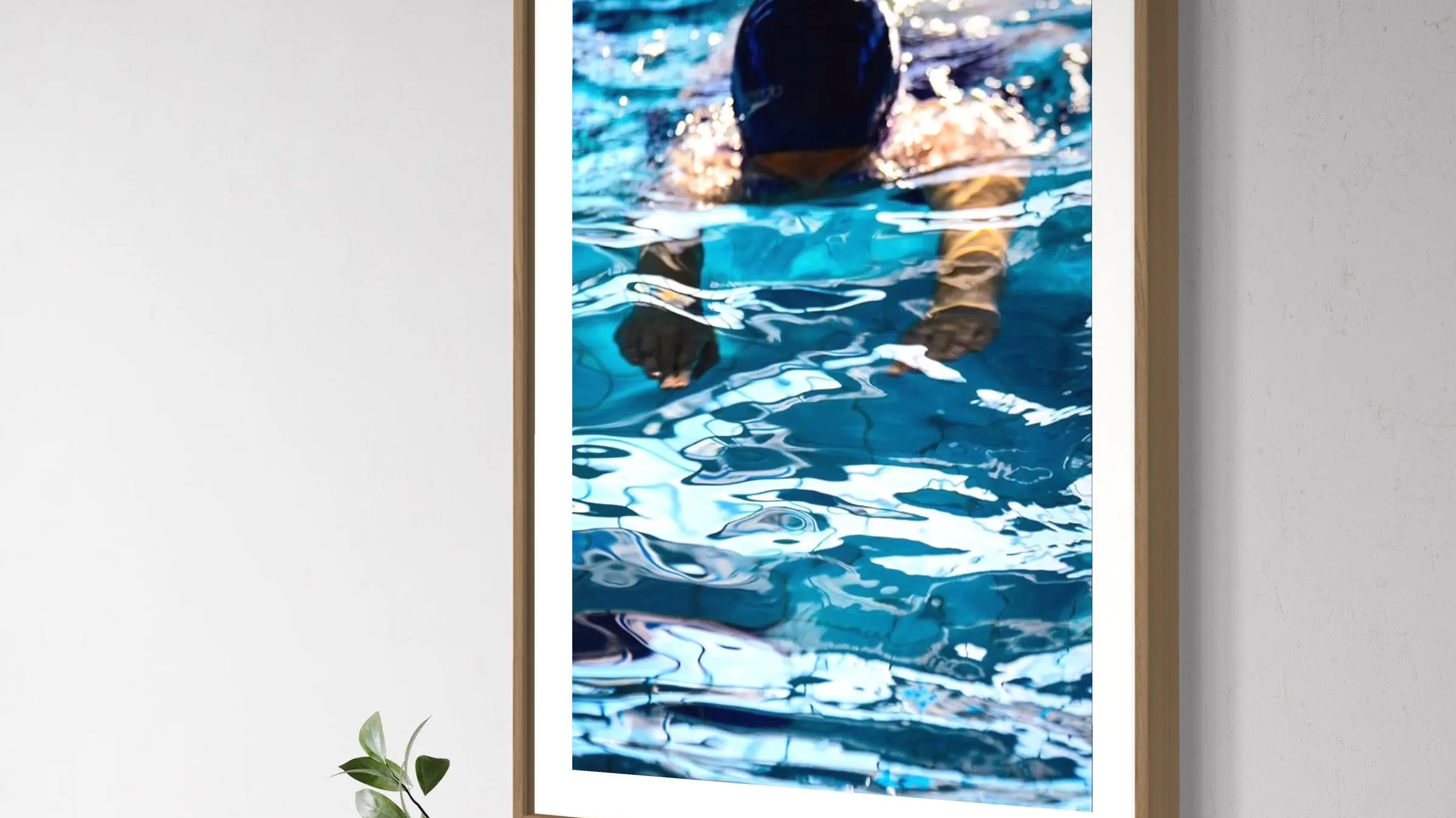
Color Psychology for Wall Art: Choosing Tones That Match a Room's Mood
Most people choose art by subject first and color second, if they think about color at all. That's backwards. The eye reads color before it reads content, which means a beautifully composed piece can still fight the room it hangs in. Here's how to choose tones room by room, from cool and muted for a bedroom to warm and saturated for a kitchen, and why undertone matters more than the color's name.
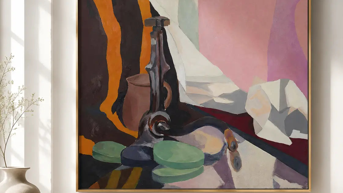
How High Should You Hang Art? The Eye-Level Rule, and When to Break It
Most people hang art the way they hang a clock, as high as their arm reaches. But the eye-level rule says otherwise: center your piece at 57 inches (145 cm) from the floor, the standard used by galleries and museums. Here's how to measure it in inches and centimeters, why the rule changes above a sofa or in a stairwell, and what Roy Caro has learned from years of watching beautiful pieces get hung four inches too high.
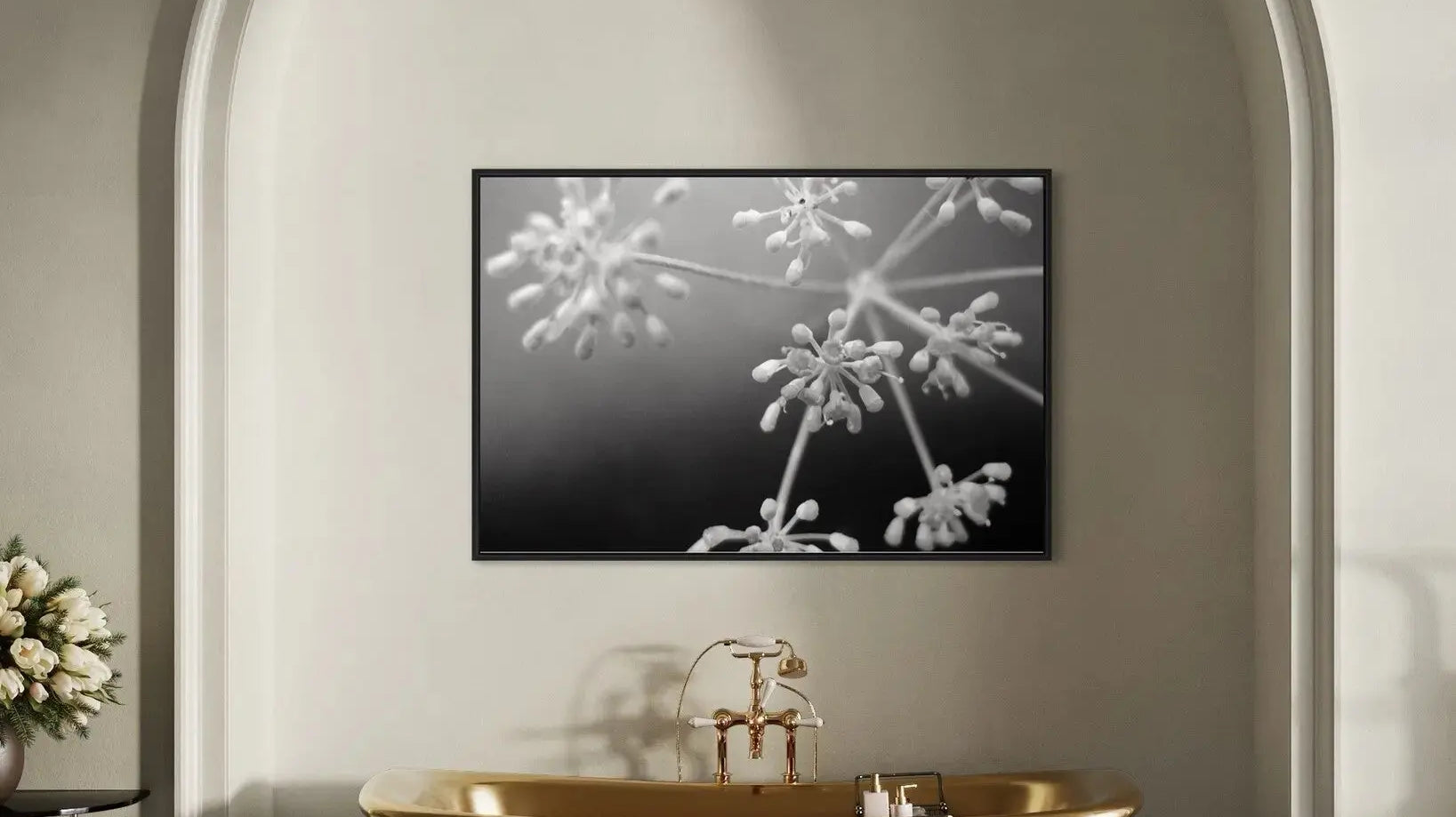
Art as a Focal Point
Every enduring interior is built around one strong anchor. Here's how to use art, not furniture, to create that focal point, and get the scale, contrast, and placement right the first time.


